2023 – 2024
Renomia RIS 2.0
A large-scale project of transforming the internal CDP system for the major international company Renomia which operates in insurance and risk management.
-

The original native Windows desktop application.
-

The new web-based responsive application.
My role
I handled most of the initial work, from project planning, user research, and designing the information architecture and user flows, to creating the first UI screens and organizing user testing.
I reviewed the work of the UX, UI, and Design System designers, ensuring quality throughout the project.
As the key person responsible for the final design, I also coordinated all product design-related activities between my team and the client, even for areas I wasn't directly involved.
The challenge
The project was extensive, involving significant content, data, and processes, with contributions from dozens of people from our team, the client, and external partners.
The main challenge was transforming a 20-year-old Windows desktop system, originally built without designer input, into a modern web application. This system is vital for the client as it manages all customer and business data. We also had to quickly establish a solid foundation for future expansions with new features and processes.
Additionally, the system serves multiple user roles with specific needs, making the design of a unified interface more complex.
The solution
The solution I proposed after initially mapping the existing system and conducting thorough interviews with users and project stakeholders consisted of three steps. All were guided by the vision of simplifying the user experience and speeding up development.
1. A rapid simplification and clarification of the information architecture, making the system's content and functions accessible to all regular users, even without prior familiarity with the system.
2. Simplifying the UI as much as possible so that the user's focus is always directed to one specific area of content, while only displaying direct and relevant information.
3. Designing the smallest possible number of template pages, from which the entire system would be built at launch. Further expansion and complexity were planned to occur only after the system was launched, based on user feedback from real-world use.
The process
Project planning
From the very beginning of the project, I was responsible for personally assembling the team, including hiring new colleagues, and for planning all related UX and UI design activities.
We needed to gather all necessary data from the client, familiarize ourselves with the existing solution, and the developers had to provide us with all the limitations and details of both the old and new technologies.
We also started planning user research and preparing for the first deliveries of our outputs.

Gantt diagram of our planned design activities.
User research
In collaboration with the client and their business analysts, I organized a series of in-person and online interviews with users of the existing solution. Very soon, it became clear through these interviews that each role has its specific needs, and the current system does not meet everyone's requirements in many different ways.
Analysis of an existing software and all GUI related processes
In collaboration with the client and their business analysts, I organized a series of in-person and online interviews with users of the existing solution. Very soon, it became clear through these interviews that each role has its specific needs, and the current system does not meet everyone's requirements in many different ways.

Mapping all the existing screens.
Information architecture
Once we had gathered enough initial data and mapped the existing application in terms of content and navigation, I prepared the first drafts of the new, significantly simplified information architecture. After discussions with the client and developers, we tested it with the actual users.
Thanks to the feedback we received, we were able to finalize our first outputs for the information architecture and began to form a clearer idea of the future navigation structure of the system.

The first version of the simplified information architecture.

A board from the information architecture workshop that includes business prioritization.
Simplification process
A consistent theme throughout the project was my emphasis on simplifying all processes and design outputs, and thus the final design solution of the new system. The old system used a so-called drill-down mechanism for accessing data, which was very confusing and complex for user navigation.
To improve it and make it less confusing for users, one of the first things I proposed was the simplification of the hierarchy of individual pages and their relationships. We successfully reduced the most complex user journey from the original ten steps to just six.

Simplyfing the drill-down data view.

Exploring different content detail view options.
Functions & content mapping
Once we had the final information architecture and a clear idea of the navigation structure, we began mapping the original content and screens onto the new, much clearer ones.
The goal was to maintain users' access to the full range of data as in the old system but in a different and significantly simplified interface.
This was made possible with great flexibility, thanks to the parallel development of the new Design System by my colleagues and the client's front-end developers. So, from the very beginning, we designed the new pages in branded UI rather than the traditional intermediate step of grey wireframes.

User flows and Data flows mapping from the old GUI to a new one.
Page templates
As the final output of our work, so-called template pages began to emerge gradually. In line with the declared simplification, we and the client ultimately arrived at just a few types of screens, which provide the same level of functionality for users as the old system, but with a significantly simplified navigation through the content.

Final UI designs.
User testing
Once we had the initial template pages ready, we were able to populate them with real data, create an interactive prototype of the future application, and test everything in a series of user testing sessions. These sessions were conducted online, and the prototype, as well as individual pages, were adjusted based on the findings.
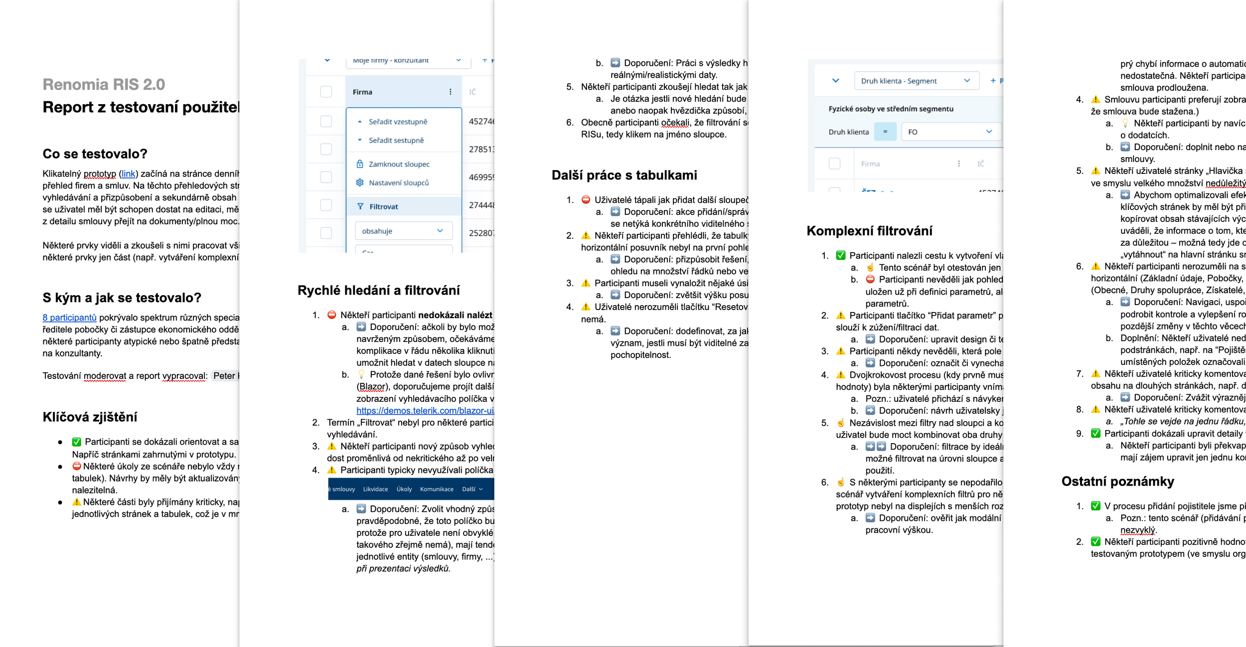
Findings and observations from the user testing.
Iterations with the key stakeholders and the developers
All these activities took place continuously over several months, in close collaboration with the client and under the direct project management of responsible individuals, following an agile approach with weekly sprints and regular meetings involving all stakeholders.
I was present for most of these project activities, personally helping to resolve many of the problems and challenges that emerged throughout the project.

Final details and fine-tuning of specific features.
The conclusion
A highly demanding, months-long project that tested both my professional readiness and that of all participants. I left the project at a stage where the beta version of the new application had been coded and launched, with the first real data starting to appear, allowing us to begin user testing of the final product of our joint efforts.
As my final contribution to the project, I proposed launching this minimal version of the application for a narrowly defined group of users, whose feedback from the live operation would help fine-tune the system and provide all participants with enough input for further planned development and improvements.