2023 – 2024 · Renomia
Renomia RIS 2.0
Moving a core data system used across the business from a twenty-year-old Windows application to a modern, responsive web product, for one of Central Europe's largest insurance brokers.
My role
I led the design side of the project from the start. That covered project planning, user research, the information architecture and user flows, the first UI screens, and the user testing that followed.
I reviewed the work of the UX, UI, and design system designers to keep quality consistent. As the person responsible for the final design, I also coordinated all product design work between my team and the client, including the parts I was not building myself.
The challenge
The project was large. A lot of content, data, and process, with dozens of people contributing from our team, the client, and external partners.
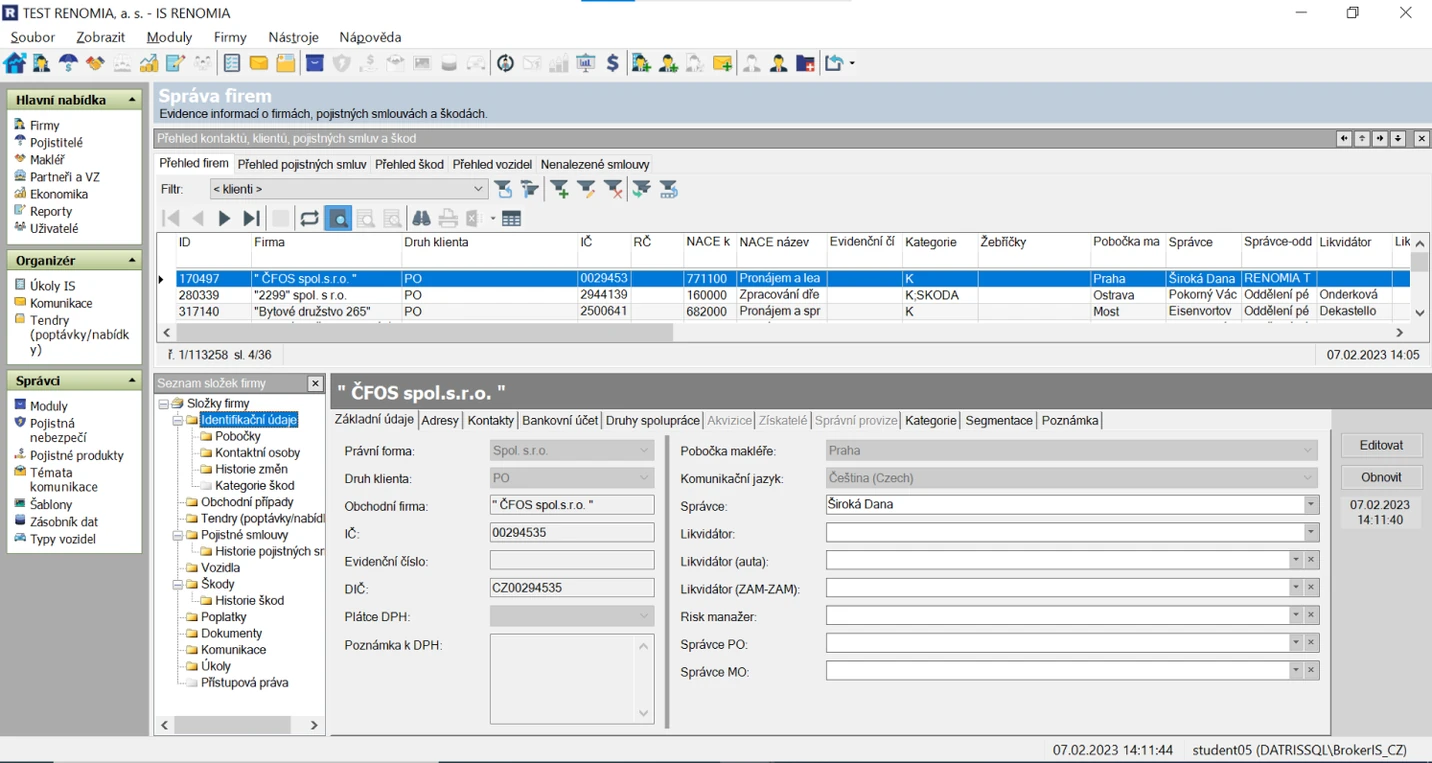
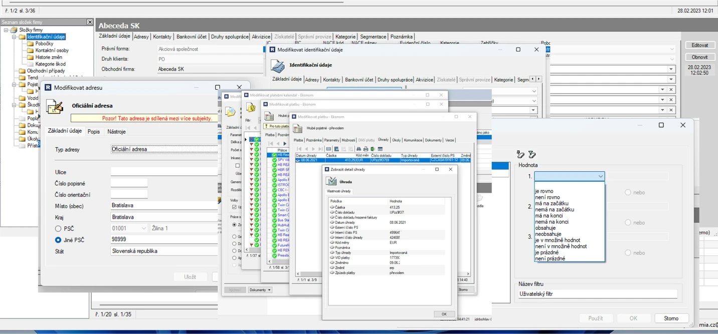
The core challenge was clear. Take a twenty-year-old Windows system, originally built with no designer involved, and turn it into a modern web application without breaking the work it supports. The system manages all customer and business data, so it cannot afford to lose function.
We also had to set a solid foundation fast, so new features and processes could be added later. And the system serves several user roles, each with its own needs, which made designing one coherent interface harder.
The solution
After mapping the existing system and interviewing users and stakeholders, I proposed an approach built on three moves. All three were guided by the same goal: simplify the experience, and make the system faster to build.
- Simplify and clarify the information architecture, so the system's content and functions are usable by everyone, even people who have never seen it before.
- Reduce the UI to its essentials, so the user's attention stays on one area of content at a time and only relevant information is shown.
- Design the smallest possible set of template pages, and build the whole system from them at launch. Add complexity later, based on how people actually use it.
Keep the full depth of the data. Remove the confusion in how you reach it.
The process
Project planning
From the start, I was responsible for assembling the team, including hiring, and for planning all of the UX and UI work. We gathered the data we needed from the client, learned the existing solution, and worked with the developers to understand the limits of both the old and new technology. In parallel, we began planning the user research and our first deliveries.
User research
With the client and their business analysts, I organized a series of interviews with users of the existing system, in person and online. It became clear quickly that each role has its own needs, and that the current system was failing them in many different ways.
We also went through the existing software and every process tied to its interface, mapping what was already there before deciding what to change.
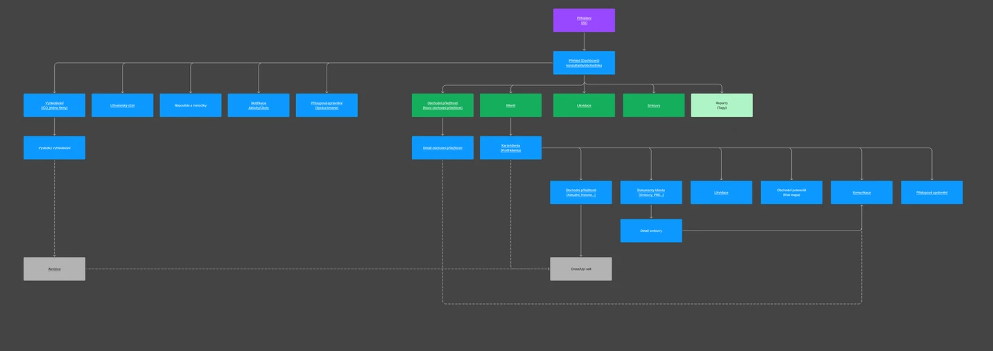
Information architecture
Once we had enough data and had mapped the old application's content and navigation, I drafted the first version of a much simpler information architecture. After working through it with the client and developers, we tested it with real users. Their feedback let us finalize the first outputs and form a clearer picture of how the new system should be structured.
Simplification
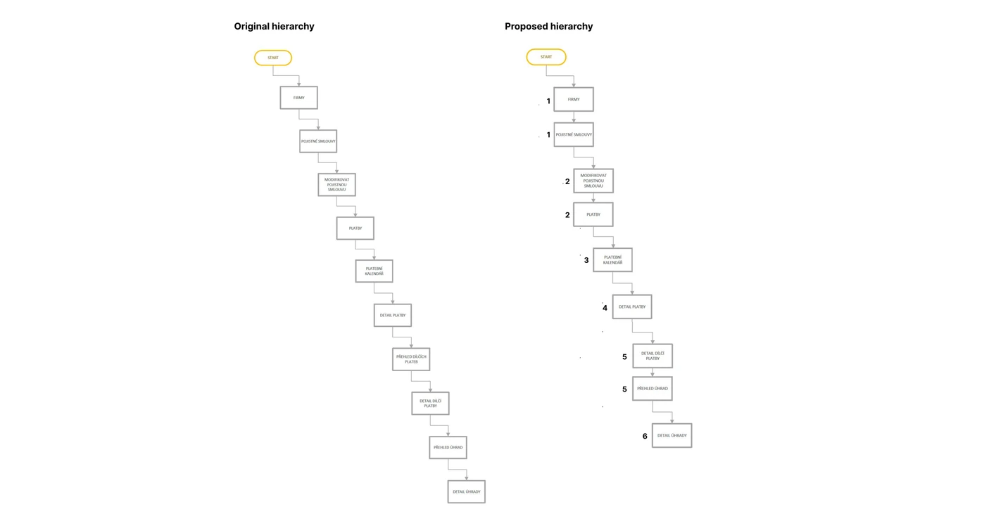
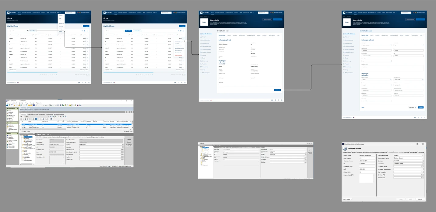
Simplification was a constant theme. The old system used a drill-down mechanism to reach data, which made navigation confusing and slow. One of the first things I proposed was flattening the hierarchy of pages and the relationships between them. We reduced the most complex user journey from ten steps to six.
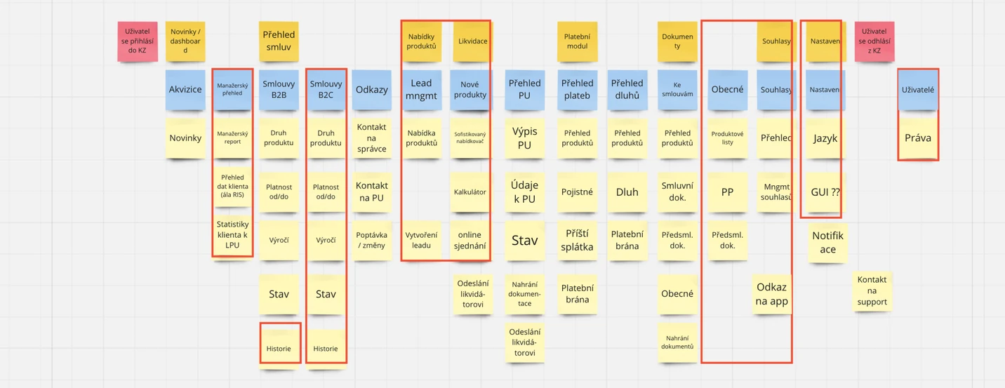
Functions and content mapping
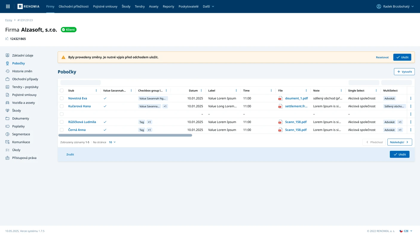
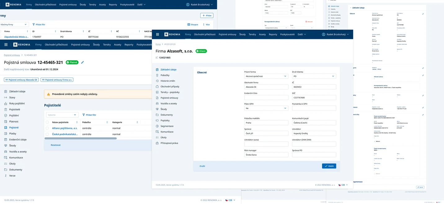
With the information architecture settled and a clear navigation structure, we mapped the original content and screens onto the new, simpler ones. The goal was to keep users' access to the full range of data while presenting it through a much cleaner interface. The parallel work on the design system, built by my colleagues alongside the client's front-end developers, let us design directly in branded UI from the start, instead of passing through the usual grey wireframe stage.
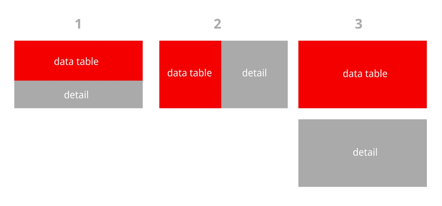
Page templates
The main output of the work was a small set of template pages. In line with the simplification, the client and I arrived at just a few types of screen. They give users the same level of function as the old system, with far simpler navigation through the content.
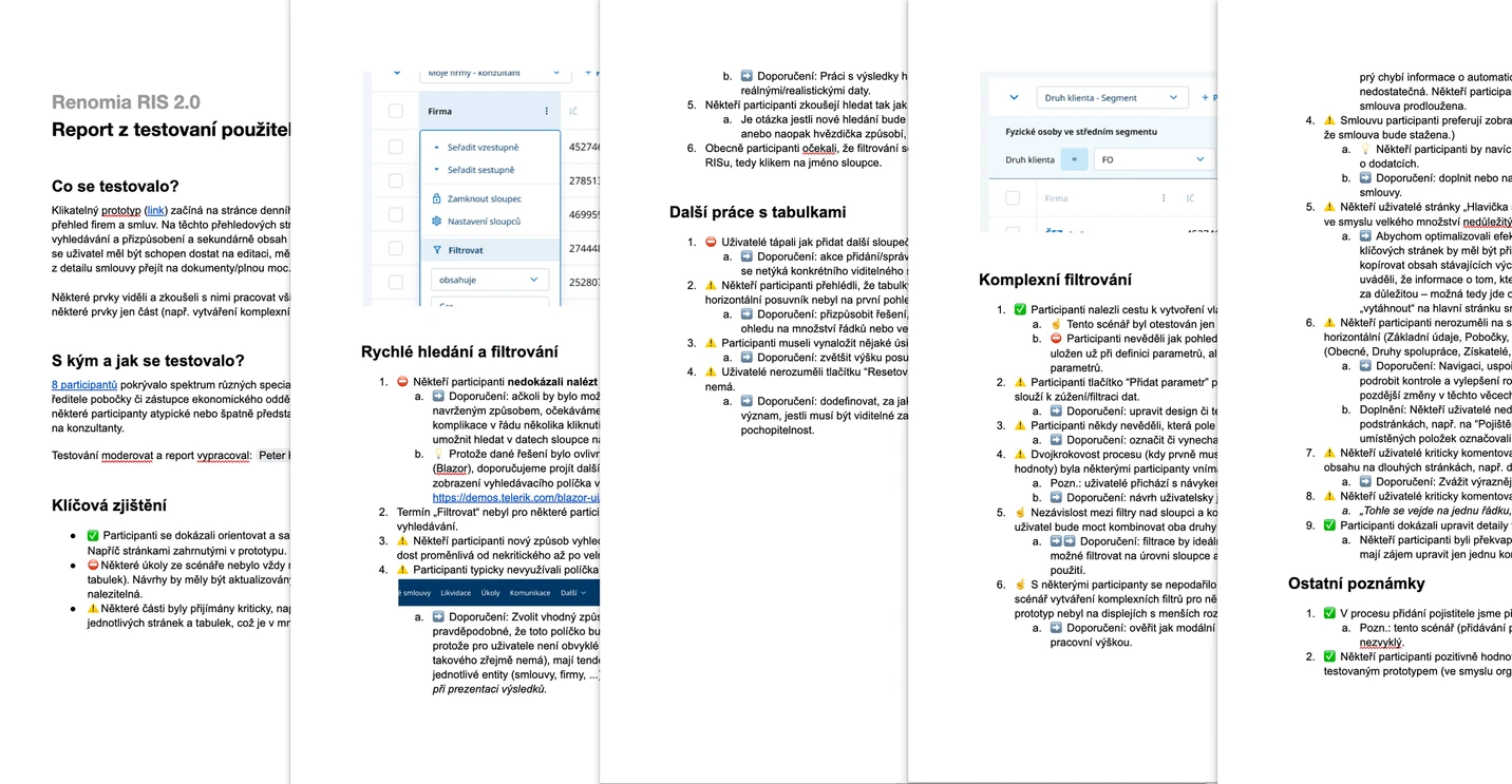
User testing
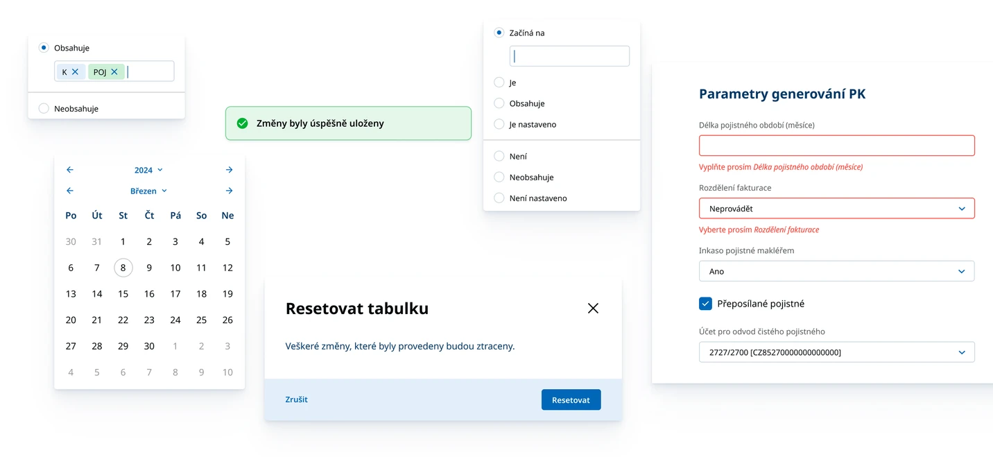
Once the first templates were ready, we filled them with real data, built an interactive prototype, and tested it in a series of sessions. The sessions were run online, and we adjusted both the prototype and the individual pages based on what we found.
Iterations with stakeholders and developers
All of this ran continuously over several months, in close collaboration with the client and under active project management. We worked in an agile rhythm, with weekly sprints and regular meetings that included every stakeholder. I was present for most of it, helping resolve the problems that came up along the way.
The conclusion
This was a demanding, months-long project that tested everyone involved, myself included. I left it at the point where the beta of the new application had been coded and launched, with the first real data starting to flow in, which let us begin testing the finished product of the work we had done together.
My final contribution was a recommendation: launch this minimal version to a small, clearly defined group of users first. Their feedback from real use would fine-tune the system and give everyone enough to plan the next stage of development.
Have a complex product to move forward?
If you are working through something tangled or unclear, that is exactly the kind of work I want to be in.
Get in touch