2023 · Creative Dock
!Zapp
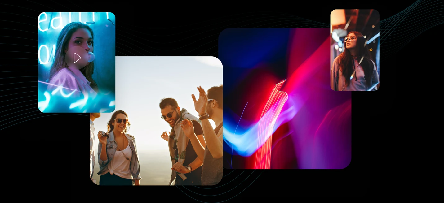
A proof-of-concept AI app that turns a younger audience's audio and video into shareable creative work, concepted, designed, and launched in about three weeks.
My role
My main job was to deliver something meaningful to the client inside a tight deadline. That included the pre-sales work, a pricing proposal tied to a clear project plan, and coordinating a team of designers and copywriters.
I developed the full functional proposition for the app: what it should do, who it is for, the key features, and how people should interact with it. I also led the communication strategy, which shaped the presentation website we used to test the concept with real audiences.
I came up with the name too, !Zapp, for the speed at which the app turns an idea into something fun to share.
The challenge
The deadline was very tight. Around three weeks to take an idea for an app and its presentation website all the way through ideation, design, development, and launch. The client was behind because their own designers could not land a solid product concept.
Soon after we started, it became clear the client was unsure of the brief too. So we had to define a genuinely useful app concept from a near-blank start, and ship it, in very little time.
The solution
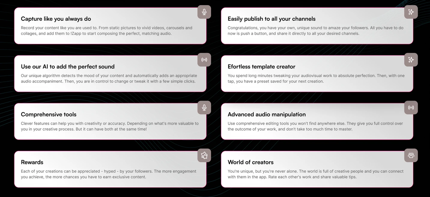
Since the client did not know how the app should look or exactly what it should do, and only knew the audience, we started by researching the apps that audience already uses. We combined that with our own work in AI and proposed turning user-generated content into shareable formats through a small set of capable, easy-to-use features. With the client, we split the app into two layers.
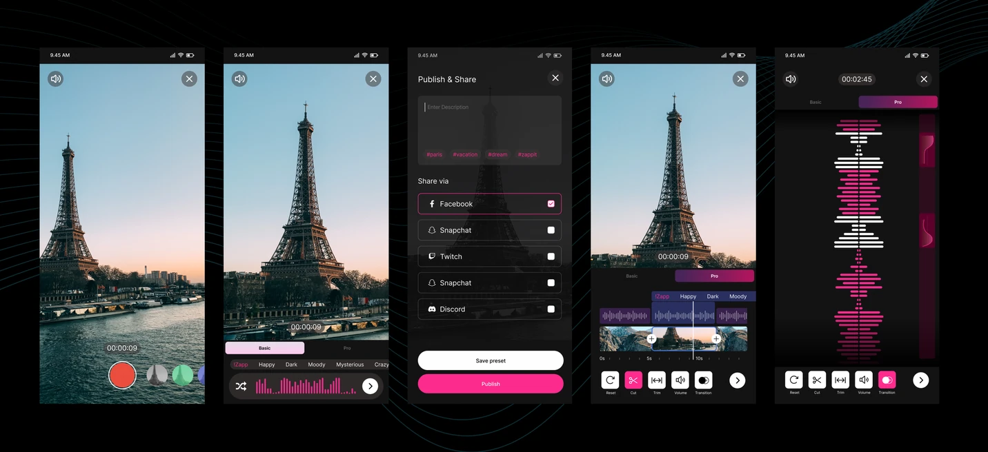
- A simple layer, accessible to almost anyone with no technical skill. A one-tap solution.
- A more advanced layer, with customizable workflows and real tools for editing video and audio.
Together, the two layers let the app serve both casual users and serious content creators.
One tap for anyone. A deeper layer for the people who want to go further.
The process
Initial meeting with the client
The client came to me directly when his own team could not land a solution for the project. He had some concepts in hand, but by his own admission they fell well short of what he wanted.
I quickly found that beyond a strict launch deadline and the fact that it was a mobile app for video and audio, almost nothing was defined. We ran a series of conversations to gather more from his side, understand his perspective, align expectations, and set clear goals.
Research
There was no time for traditional user research, and the goal was really to test an idea, so I proposed a lean approach that still rested on real insight.
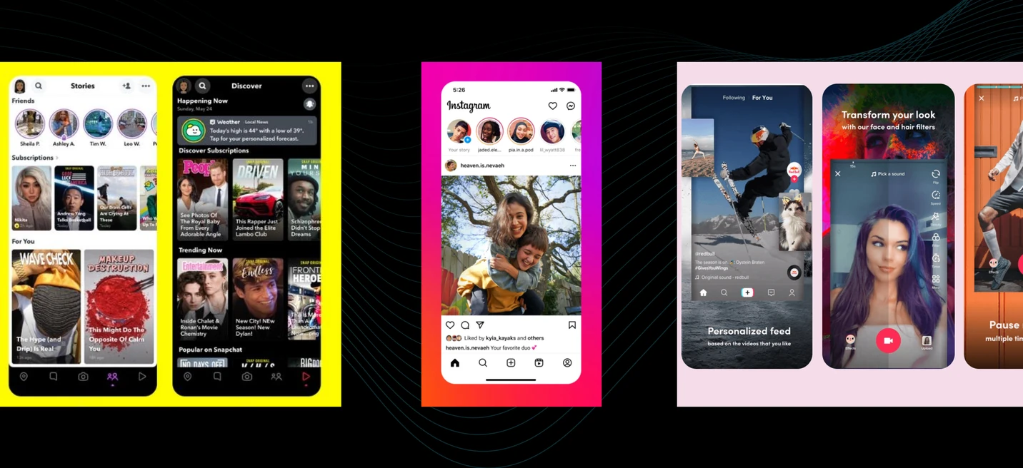
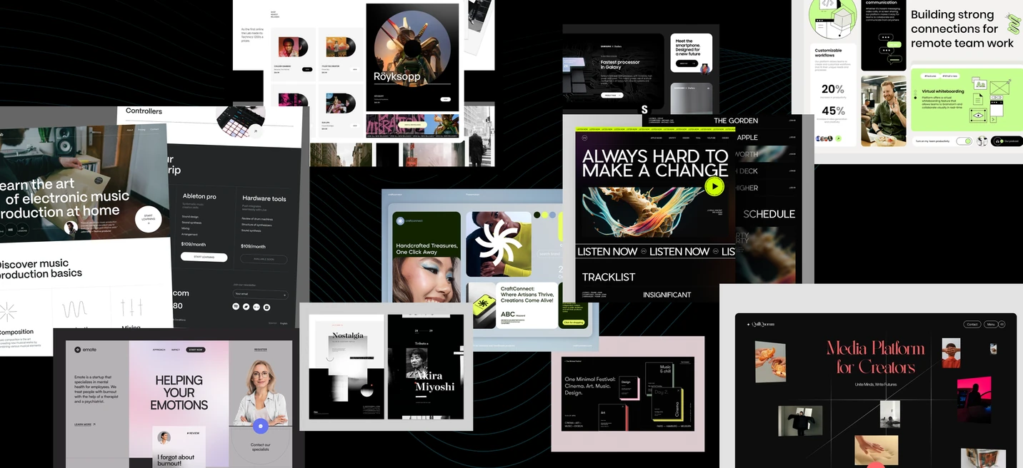
First, my colleagues and I reviewed modern audio and video apps that lean heavily on social media. We installed each one, made accounts, and explored them to see which features people already know and which are hard to grasp on first use.
Next, we looked at platforms that showcase top audiovisual work, to understand what excellent output looks like and how our app's output should feel. Finally, we refreshed our understanding of what AI can actually do today, so we could attract users with real capability rather than overpromising.
The idea
Before designing anything, we had to define a clear idea that was distinctive, appealing to the audience, and technically achievable.
The app's features did not need to break new ground. The goal was not a technical revolution, but making existing technology far more accessible and pleasant to use.
We simplified the whole flow of creating and editing video and audio, and publishing it to social media, so anyone could do it in seconds, even on a bus or waiting in line for a concert. We then set out those principles and benefits as a clear, step-by-step process.
App concept
From the ideation, the client input, and our research, I developed and finalized the app concept quickly through several fast iterations. That covered the design, the features, and the overall logic of the interface.
The concept kept a simple flow for inexperienced users while letting more advanced features be switched on by experienced ones. To move fast, we used freely available graphic resources rather than building every element by hand, which freed the team to focus on the logic and coherence of the product.
Website wireframes
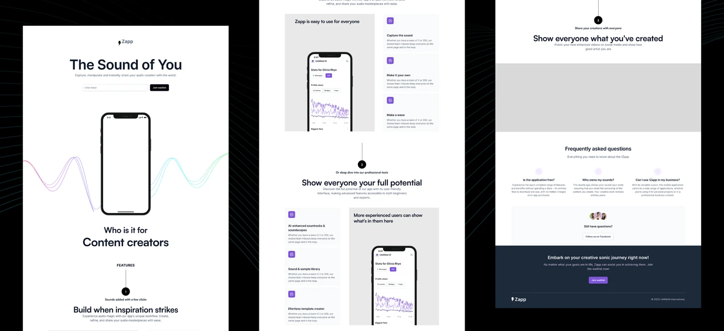
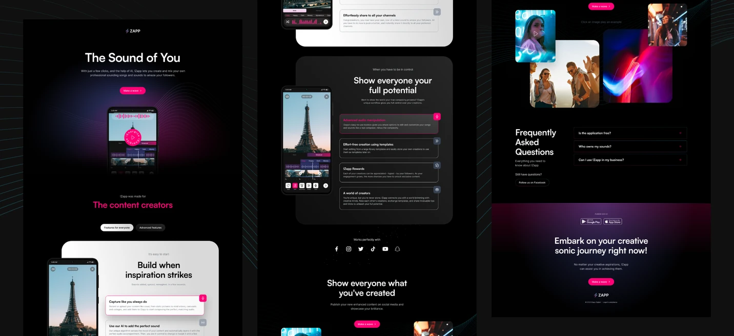
The way to validate the idea was a presentation website that introduced the app and its benefits to the audience.
Beyond showing the features, the website's real job was to measure genuine interest. So I designed a clear path from a social media ad to signing up for a waiting list to test the future beta. I then wireframed the site around that story, guiding people to leave their email.
Visual exploration
With my colleagues, we presented several visual directions for the website to the client. Each was prepared by finding a graphic style that fit the app's qualities, using mood boards and current visual trends among younger users.
Even though visual design was not my main responsibility, I gave the designers feedback throughout and helped present and argue the work in client meetings.
Final UI designs
Finally, we prepared the complete UI for the site, including responsive variants, animation, and components for the developers. Through this phase, and the build and launch that followed, I supervised from an organizational standpoint.
The conclusion
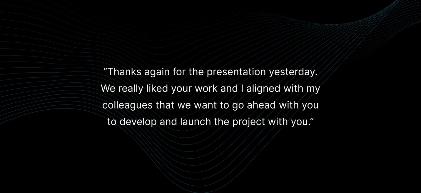
Despite the lack of information from both the client and end users, the project was concepted, designed, built, and launched on time and on budget, and started collecting feedback from real users.
The client and their own team contributed a lot of the final copy for both the app and the website. By launch, only the client and their analysts and marketers were involved, so what happened after handover was beyond our control. By the client's own account, we exceeded their expectations, and on quality and speed beat their internal teams.
Have a complex product to move forward?
If you are working through something tangled or unclear, that is exactly the kind of work I want to be in.
Get in touch